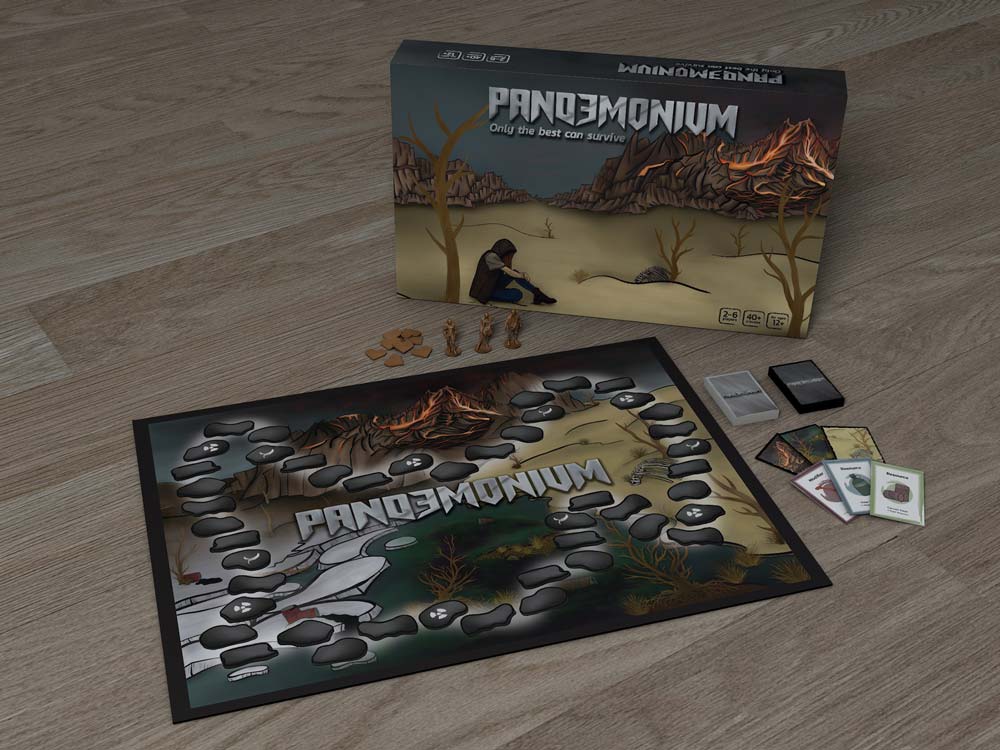
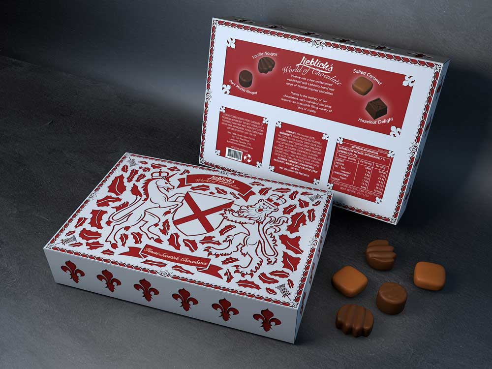
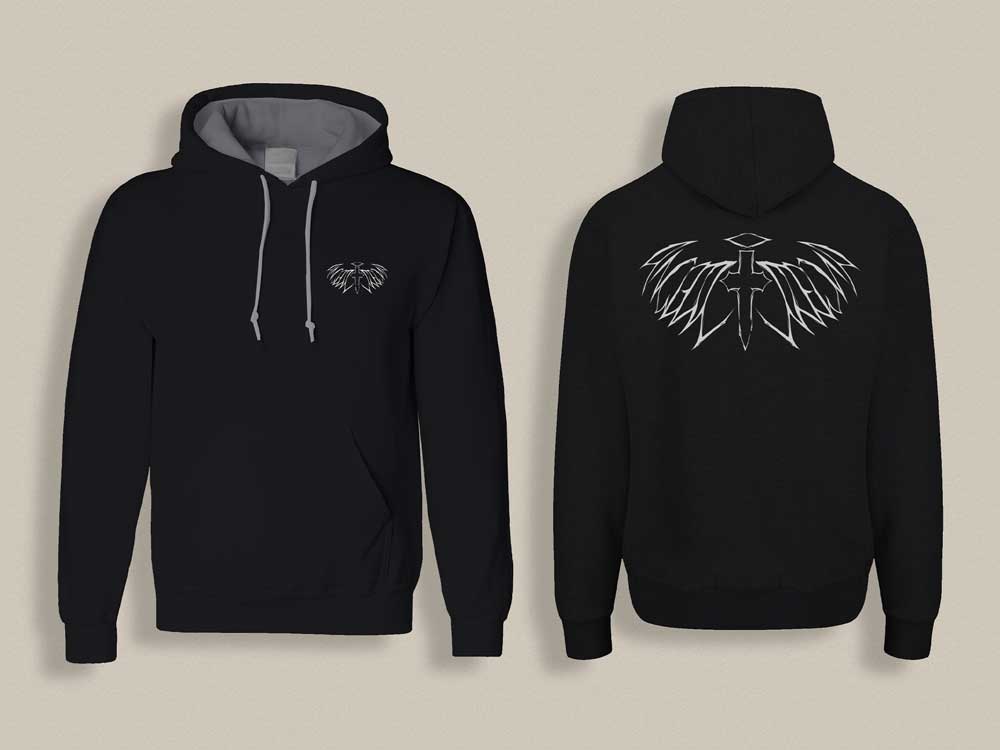
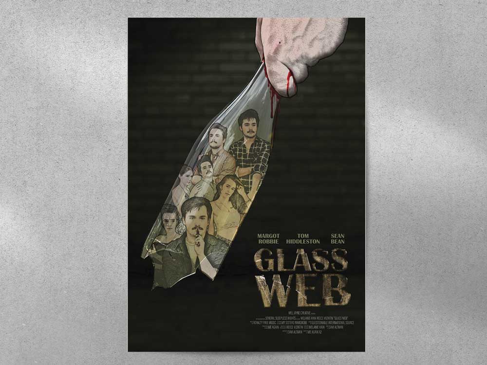
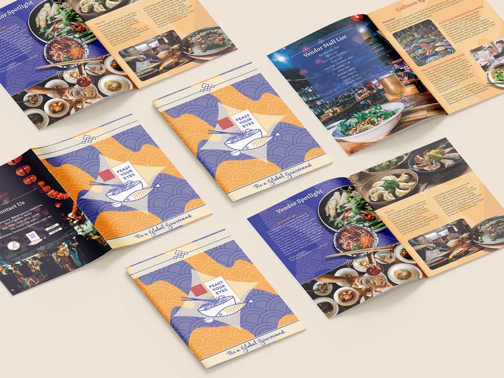
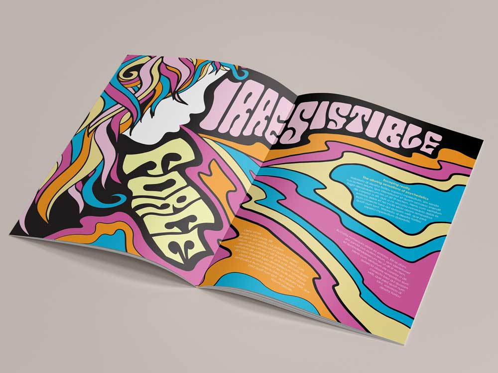
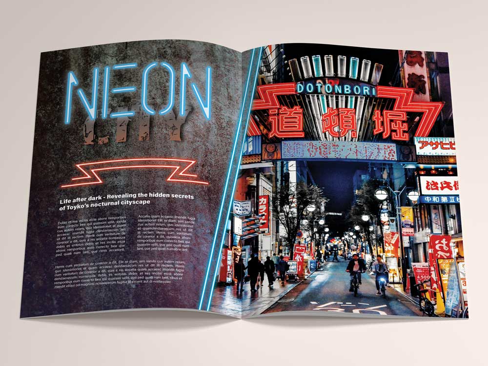
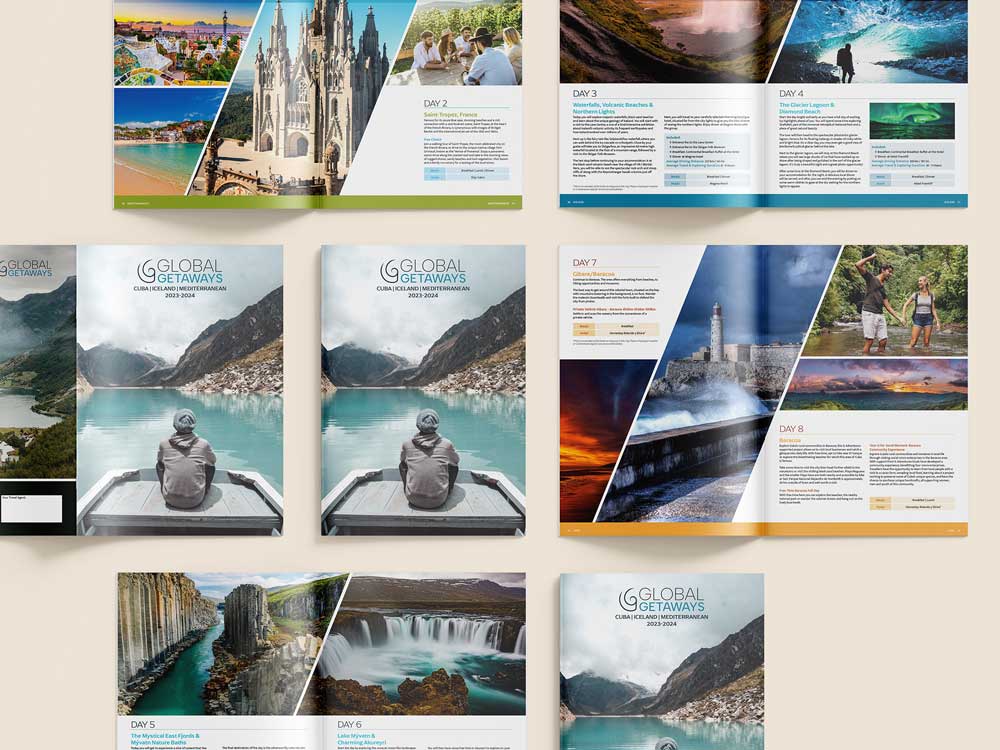
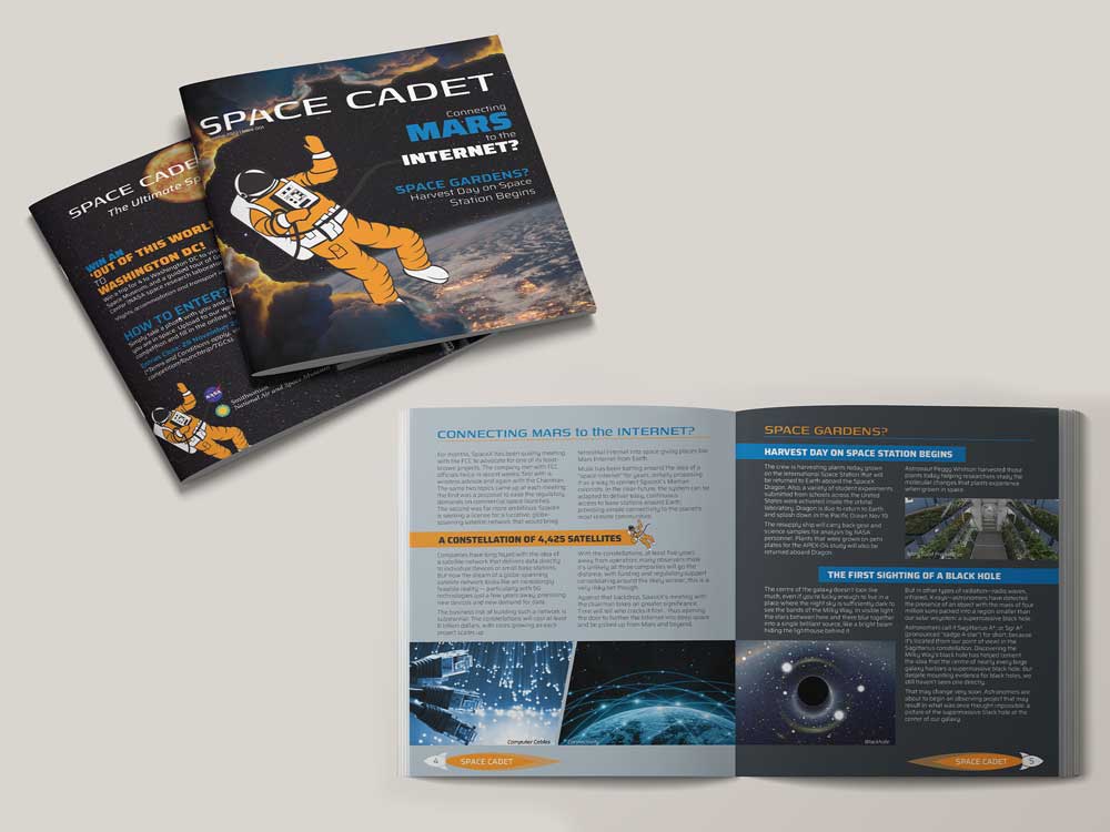
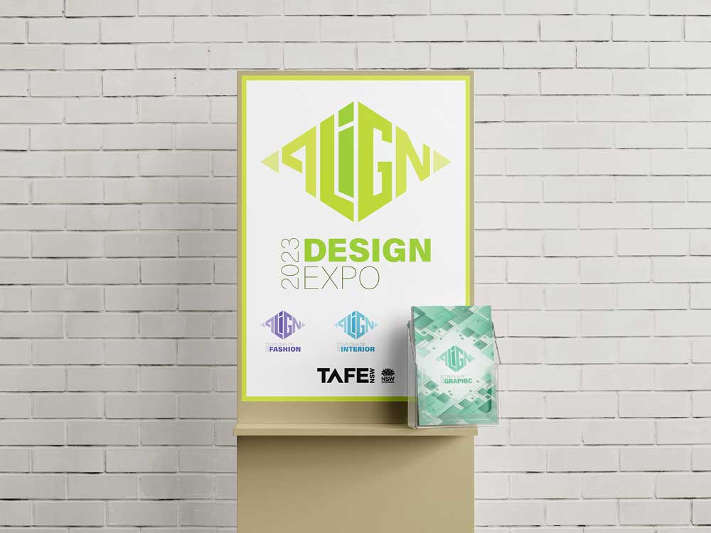
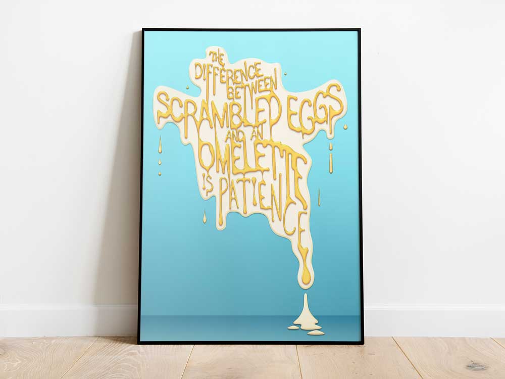
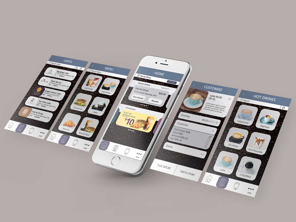
BOARD GAME DESIGN | ILLUSTRATION | 3D MODELLING <br>
PANDEMONIUM is a concept for a board game that is inspired by the collapse of society due to the effects of global warming. The hand-drawn illustrations and dark, cold colours create the sombre, dreary atmosphere of the game. The final board, box and cards were imported into Cinema4D alongside the 3D playing pieces before being rendered.
PANDEMONIUM
PACKAGING DESIGN | ILLUSTRATION <br>
The Scottish inspired chocolate box is part of Lieblich's World of Chocolate international luxury chocolate range. To highlight the country of origin, a version of the Royal Coat of Arms and their national flower - the thistle - have been cut from the outer casing.
Lieblich's World of Chocolate
ILLUSTRATION <br>
Angelic Vienna - a heavy metal band - required a design that reflects the chaotic nature of their music.
Angelic Vienna
POSTER DESIGN | IMAGE MANIPULATION <br>
The design has been executed with image manipulation and typography to promote the murder mystery film 'Glass Web'.
Glass Web
BROCHURE DESIGN <br>
The brochure's purpose is to promote the Vietnamese food festival Feast Your Eyes. The design focuses on the unique street food culture through vibrant colours and patterns.
Feast Your Eyes
EDITORIAL DESIGN <br>
‘Irresistible Force’ is a design utilising the title to influence the editorial topic. This work pays tribute to the 1960’s psychedelic art movement whilst highlighting the issues of psychedelic drugs during this period.
Editorial Spread Design
EDITORIAL DESIGN <br>
‘Neon City’ is a design utilising the title to influence the editorial topic. This work takes the opportunity to reveal the surreal, contrasting world of Tokyo at night.
Editorial Spread Design
BROCHURE DESIGN <br>
Global Getaways travel brochure is designed to promote three different holiday packages that each focus on an unique travel experience.
Global Getaways
MAGAZINE DESIGN | ILLUSTRATION <br>
Air & Space Magazine wanted to create a mini space magazine that was designed for intelligent 9-12 year olds. To encourage younger readers, Sammy the SPACEMAN was created as a mascot.
Space Cadet
BRANDING | BROCHURE DESIGN <br>
The ALIGN project is a co-operative project designed to promote and celebrate the graduating diploma students across interior, fashion and graphic design courses.
ALIGN Design Expo
TYPOGRAPHY <br>
'The difference between scrambled eggs and an omelette is patience' Poster design featuring a quote that holds personal meaning. Typography is hand-drawn with Photoshop effects to create the illusion of egg yolk.
Typography Poster
UI/UX INTERFACE DESIGN <br>
An app promoting a fast food delivery service The interface was purposely designed to be intuitive and easy to use for a large audience varying in age.
App UI/ UX Design